Types of Charts - JSS3 Computer Studies Lesson Note
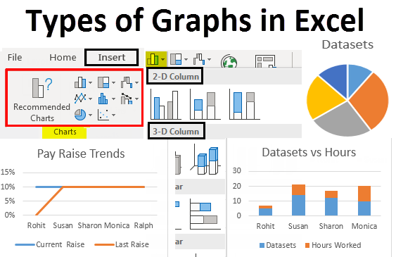
There are various types of charts, each designed to represent different types of data and highlight specific insights. Common types include:
-
Bar Charts: Display data using rectangular bars of varying lengths, with the length of each bar corresponding to the data it represents. Bar charts are effective for comparing values across categories.
-
Line Charts: Represent data with points connected by straight lines, emphasizing trends and changes over time. Line charts are suitable for illustrating continuous data points.
-
Pie Charts: Display data in a circular graph, with each slice representing a proportion of the whole. Pie charts are useful for showcasing the distribution of parts within a whole.
-
Scatter Plots: Plot individual data points on a two-dimensional graph to show relationships between two variables. Scatter plots help identify correlations and patterns in data.
-
Area Charts: Similar to line charts, area charts represent data with points connected by lines, but the area beneath the lines is filled. This type of chart is effective for displaying cumulative data.
-
Histograms: Depict the distribution of a dataset, with bars representing the frequency of data within specified ranges. Histograms are valuable for understanding the shape of a distribution.

Image from EDUCBA: Charts/Graphs